Introduction
I have posted three documents on trends in income inequality under Conservative governments 1979 - 1997 ,Labour governments 1997-2010 and a shorter document on trends in income inequality and poverty from 2010 to 2022.respectively. There is relatively limited discussion on these three documents of the technical details involved in the analysis of the trends in economic inequality and this fourth document might be seen as a technical appendix to the preceding documents in which I do outline in more detail some of the technical issues involved in analysing these trends and links are made from the three other documents to this one which students may use if they require further points of clarification.
[The trends are analysed in much greater detail on several internet sites, and I shall rely especially on reports from the Department of Work and Pensions, the Office of National Statistics, the Institute of Fiscal Studies. the House of Commons Library and the Resolution Foundation .]
Click here for Households Below Average Income from the DWP.[Updated annually]
Click here for The Effects of taxes and benefits on Household income 2022 [ONS}.[Updated annually]
Click here Income Inequality [House of Commons Library Briefing].
Click here for The Living Standards Outlook [Especially pages 76-68] [Resolution Foundation]
Click here Living Standards, poverty and inequality in the UK 2023 [Institute for Fiscal Studies]]. .[Updated annually]
The Distribution of Household Income
Since the end of the 2nd World War, on average, people in Britain have become better off and nowadays enjoy higher real incomes and better standards of living. More people have a range of consumer durables such as cars , washing machines and personal computers and can afford foreign holidays which would have been considered luxuries immediately after the Second World War. However despite this general rise in affluence it is also the case that the actual distribution of national income even in the early 21st Century is still quite unequal and in this document we shall investigate the extent of income inequality in the UK and /or Great Britain.
The analysis of trends in the distribution of income presents several technicalities.
- We must recognise the importance of the various definitions of income which are used in connection with the analysis of the distribution of income. Thus , for example, the overall distribution of income varies considerably depending upon whether we measure it before or after the subtraction of taxation and addition of state benefits.
- We must recognise the importance of the use of equivalised household income as a means of placing different types of household within the overall distribution of household income. Thus for example a family with three children receiving a total income of £ 30,000 p.a. will clearly be located at a lower position within the overall distribution of income than a single individual receiving £ 25, 000 p.a.
- We must understand the construction and calculation of Lorenz Curves and Gini Coefficients which are used to provide summary measures of trends in the distribution of income. If the Gini Coefficient for the distribution falls this means that overall income inequality has fallen and vice versa but how are these conclusions arrived at?
- Trends in the distribution of income are also sometimes presented in terms of the shares of national income received by various quintile and decile shares and in terms of the ratios between the shares received by highest and lowest deciles and/or quintiles. We shall look at these statistics.
- However trends in decile and/or quintile shares distract attention from the shares of national income received by percentiles at the highest and lowest extremes of the income distribution. We shall look at these statistics too.
Equivalised Household Income
Data on the distribution of household income in Great Britain and the UK are constructed so as to provide an approximate estimate of differences in living standards and are therefore based upon the assumption that household incomes are a very important determinant of living standards [although it is ,of course, recognised that they are not the only determinant.]
Households with differing membership but the same equivalised household disposable incomes are placed at the same point within the distribution of income data based upon household equivalised income and it follows therefore that income distribution data based upon equivalised household income do provide an approximation for the distribution of living standards. Contrastingly if households were positioned within the distribution on the basis of the actual and unequivalised incomes the data constructed in this way would provide a very inaccurate approximation of the distribution of living standards within the population since for example a single person household with an income of £300 per week would obviously have a better standard of living than a couple with one child with an income of £ 300 per week..
Further information on the distribution of equivalised household disposable income is provided below.
Click here for Equivalised Income explanation from the DWP.
Detailed explanation of the concept of Equivalised Income can be found in an Appendix to the DWP’s Households Below Average Income Documents and I reproduce the relevant extract below.
Equivalisation using the modified OECD scales .
The income measures used in HBAI take into account variations in the size and composition of the households in which individuals live. This reflects the common sense notion that, in order to enjoy a comparable standard of living, a household of say three adults will need a higher income than a single person living alone. The process of adjusting income in this way is known as equivalisation and is needed in order to make sensible income comparisons between households. Equivalence scales conventionally take an adult couple without children as the reference point, with an equivalence value of one. The process then increases relatively the income of single person households (since their incomes are divided by a value of less than one) and reduces relatively the incomes of households with three or more persons, which have an equivalence value of greater than one. Consider a single person, a couple with no children, and a couple with two children aged fourteen and ten, all having unadjusted weekly household incomes of £200 265Appendix 2 266 (Before Housing Costs). The process of equivalisation, as conducted in HBAI, gives an equivalised income of £299 to the single person, £200 to the couple with no children, but only £131 to the couple with children. In line with international best practice, the main equivalence scales now used in HBAI are the modified OECD scales, which take the values shown in Table A2.1. The equivalent values used by the McClements equivalence scales are also shown for comparison alongside modified OECD values. The McClements scales were used by HBAI to adjust income up to the 2004/05 HBAI publication. In both the modified OECD and McClements versions two separate scales are used, one for income Before Housing Costs (BHC) and one for income After Housing Costs (AHC). The construction of household equivalence values from these scales is quite straightforward. For example, the BHC equivalence value for a household containing a couple with a fourteen year old and a ten year old child together with one other adult would be 1.86 from the sum of the scale values: 0.67 + 0.33 + 0.33 + 0.33 + 0.20 = 1.86 This is made up of 0.67 for the first adult, 0.33 for their spouse, the other adult and the fourteen year old child and 0.20 for the ten year old child. The total income for the household would then be divided by 1.86 in order to arrive at the measure of equivalised household income used in HBAI analysis.
Definitions of Income and the Distribution of Income
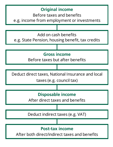
In order to describe the distribution of income it is first important to distinguish between 5 distinct definitions of “Income” and to note that the distribution of Original Income is much more unequal than the distribution of income after taking account of the impact of taxation and government spending. The impact of taxation and government spending on the distribution of income is analysed in several stages as outlined in the schema below which distinguishes the relevant 5 different kinds of “income” used in the analysis of the distribution of income : original income, gross income, disposable income, post-tax income and final income
- Original income is income received from employment, savings and investment before government intervention of any kind such as through payment of social security benefits and the imposition of taxation.
- Gross income = Original income + social security cash benefits.
- Disposable income= Gross income – direct taxes and National Insurance contributions.
- Post-tax income = Disposable income- indirect taxes.
- Final income = Post-tax income + benefits in kind such as health and education.
| Activity: Different Definitions of Income
When economists and sociologists analyse the distribution of income they distinguish between 5 distinct definitions of income1. List the 5 distinct definitions of income which are used. 2. Explain the difference between original income and gross income. 3 Explain the difference between gross income and disposable income. 4. Explain the difference between disposable income and post tax income. 5 Explain the difference between post tax income and final income 6. Explain briefly the difference between original income and final income. |
Data on the Distribution of Income in the UK
The Department of Work and Pensions. [These data have been collected for Great Britain rather than the UK]
Bearing in mind the above information on the meaning of equivalised household income and the various possible measures of income used to analyse the distribution of income let us consider the following data from the Department of Work and Pensions on the distribution of income in the UK
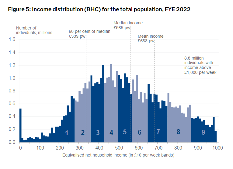
In relation to the diagram, we may note the following main points.
The definition of income adopted in this diagram is “net equivalised disposable household income before housing costs where income includes contributions from earnings, state support, pensions, and investment income among others and is net of tax,” Delete points 1-10 and add new points 1-9
- You will notice that households are allocated to £ 10 bands within the income distribution based on equivalised weekly household income My following references to “income” in the following 9 points refer to “weekly equivalised household income.”
- The diagram illustrates the number of individuals in households receiving varying levels of equivalised income grouped into £10 bands. For example, about 200,00 individuals were living in households with equivalised incomes of between ££190 –£200 per [
- The alternating dark blue and grey blocks refer to deciles of the households within the population. Thus ,for example, the diagram illustrates that the lowest decile [i.e. the lowest 10%] of household income recipients received incomes varying between £0-£270 [approx.] per week. and that the next lowest decile received incomes of between £270-£ 360 [approx..] per week and so on.
- In any analysis of the distribution of income it is important to distinguish between the mean and median incomes of the population. We may use the following hypothetical example to illustrate the difference between mean and median income. Imagine 5 households with the following weekly income levels: £940 p w; £620 per w ; £ 350 per w; £130 per w; and £60 per w. To calculate the mean weekly household income, we add the 5 weekly household incomes and divide by the number of households= £2100/5 = £420. per week .The median household weekly income is that which is the middle value of our 5 household incomes and in this example, it is £350 per week .
- In the diagram the high incomes of the minority of individuals at the top end of the income scale have the effects of raising the mean income so that in fact 2/3 of individuals in Great Britain receive the incomes below the mean income. and this means that it is also important, therefore, to consider the value of the median income when analysing the distribution of income.
- The mean weekly household disposable income is £688per week and the median weekly household disposable income is £ 565 per week . These are the mean and median incomes for childless couple households . The mean and median weekly incomes of households of different compositions are different from these figures and are calculated via the use of the weighting system which is explained earlier in this document.
- A weekly income of £339 per week for a childless couple represents an income equal to 60% of the median income. This figure is highlighted because individuals with incomes below this figure are defined by the UK government to be living in poverty. I shall provide information on poverty in subsequent documents.
- Note that households in the 9th decile receive weekly incomes of between £870 -£1000 per week.
- However, 8.8 million individuals in the omitted tenth and final decile receive more than £1000 per week and in some cases much more than this and if we were to subdivide these individuals into £10 income bands there would have to be a vast extension of the horizontal axis to represent them on the diagram. For example, some top professional soccer players earn £100,000 + per week and to incorporate them the horizontal axis would need to extend for about 1.5 metres. How long would the horizontal axis of the diagram need to be to incorporate the UK equivalent of Jeff Bezos or Elon Musk?
| Activity: The following activity is based upon the above diagram.
1. The definition of income adopted in the diagram is “disposable income before housing costs”. Define “disposable income.”2. .Use the diagram to estimate approximately how many individuals live in households receiving between £0 and £100 per week. {You will need to estimate by eye how many individuals receive between £0 and £10, how many receive between £10 and £20 and so on…] 3 .Use the diagram to estimate how many individuals live in households receiving between £300 and £400 per week. 4. Use the diagram to estimate how many individuals live in households receiving between £900 and £ 1000 per week. 5. How would you have to modify this diagram if you wanted to include the incomes of very high income recipients in the diagram? |
You may click here to access the Effects of taxes and benefits on UK household income: financial year ending 2022 and much of the next section of these notes refers to diagrams and tables taken from this publication.
It is also useful at this point to recall the different types of income which as to be considered via this brief extract from Income Inequality [House of Commons Library Briefing[2023.] Notice however that the diagram does not include Final Income .
You may note the following points in relation to these data.
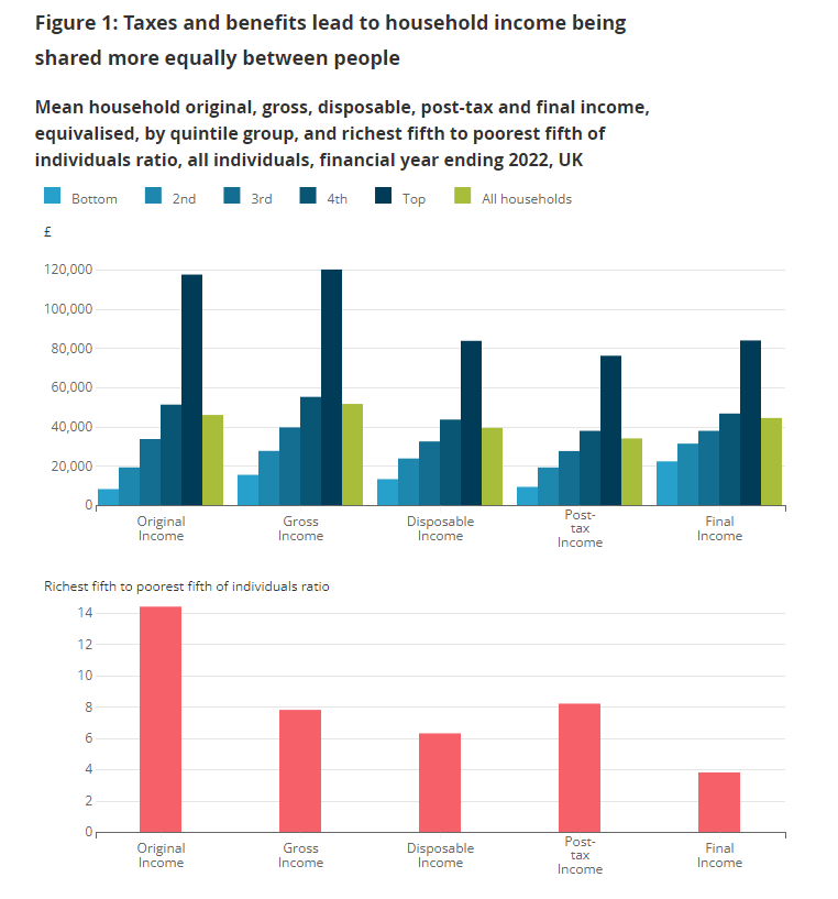
Referring now to Figure 1 below and bearing in mind the various definitions of income it is clear that the overall effects of taxation and social benefits are to redistribute income from the highest to the lowest quintile of income recipients.
You may note the following points in relation to these data.
Referring now to Figure 1 below and bearing in mind the various definitions of income it is clear that the overall effects of taxation and social benefits are to redistribute income from the highest to the lowest quintile of income recipients.
This same information is presented numerically in the following table.
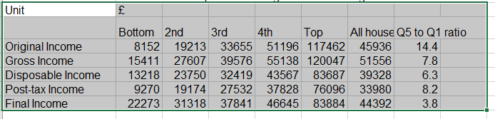
Referring to the above table:
- It is very clear that the main mechanism for this increase in equality is provided by social security cash benefits which are paid disproportionately to lower original income recipients, and which therefore cause gross income to be distributed far more equally than original income. Note the change in the final column figure from 14.4 [original income] to 7,8 [ gross income]
- To analyse the effects of taxation on the distribution of income we must distinguish between proportional, progressive and regressive taxes. Individual taxes may be classified as proportionalwhere as income increases the proportion of income paid in taxation remains constant; as progressive whereas income increases the proportion of income paid in taxation increases; or as regressive where as income increases the proportion of income paid in taxation falls.
- Income taxes, employees national insurance contributions and the council tax are defined as direct taxes and these combined direct taxes are progressive and cause income inequality to be reduced such that whereas the highest quintile of gross income recipients receive 7.8 times higher gross incomes than the lowest quintile of income recipients the highest quintile of disposable income recipients receive 6.3 times higher disposable income than the lowest quintile of disposable income recipients. Direct taxation therefore increases income equality, but it does not do so by much .
- The redistributive effects of direct taxes on the distribution of income are more than offset by the effects of regressive indirect taxation [mainly VAT and duties on alcohol and tobacco] which cause the Highest quintile : Lowest quintile ratio to rise back to 8.2. {However, an interesting technical detail is that the effects of indirect taxation do not fully offset the effects of direct taxation on the overall distribution of income.[See information below on Gini Coefficients,]
- Benefits in kind are included in Final Income and these serve to further redistribute incomes so that in the case of Final income the Highest quintile : Lowest quintile ratio falls to 3.8.
- Benefits in kind serve to increase Final income equality as is indicated by the fact that for final income the ratio of highest quintile income recipients to lowest quintile income recipients has fallen to 4.We might for example envisage that many pensioners are relatively poor and also disproportionately likely to use the health services; that large families are disproportionately likely to be poor and also have children likely to be using state education services and also that households in the highest quintile are more likely to use Private Education [and Private Health Care] which reduces the average benefits in kind gained via the use of state education and health Services. However upper quintile families who do use the state services are likely to benefit disproportionately from them in that, for example, they may use the services of their GP more effectively and the children of middle and upper class parents are more likely than the children of working class parents to achieve educational success.
In Figure 2 below, Gini Coefficients are presented for the financial year ending 2022 for each of the different kinds of income, and it is shown that Cash Benefits, Direct Taxes and Benefits in Kind serve to reduce income inequality and therefore to reduce the Gini Coefficient but that Indirect taxes serve to increase income inequality and therefore increase the Gini Coefficient.
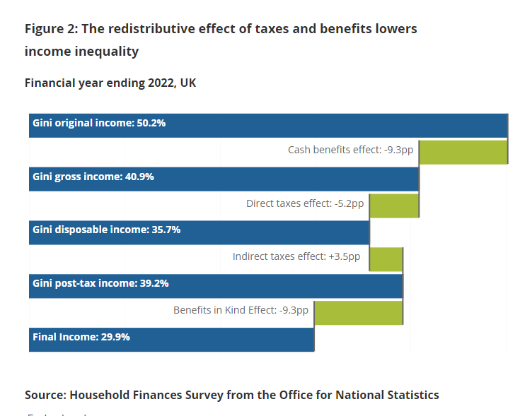
- The data show very clearly that , in terms of the five categories of income listed above, original income is distributed more unequally than final income which in turn means that the overall effects of taxation and social security benefit policies are to redistribute income from the highest to the lowest income recipients.
- However even after the effects of such redistribution, the highest 20%[i.e. the highest quintile] of income recipients receive incomes which are on average 4 times higher than the incomes received by the lowest 20% [i.e. the lowest quintile] of income recipients. This is the key conclusion of the data on the distribution of income which I wish to emphasise at this point in this document.
- Notice also that there are no comparisons between the incomes the top 1% and top 10% of income recipients and the bottom 1% and 10% of income recipients and income differences between these groupings would obviously be far greater than those between the top and bottom quartiles of income recipients.
- Information on the incomes of the top 1% of income recipients can be found in the IFS article]2020] on for The characteristics and incomes of the top 1%. For some earlier information [2008] see this Link to Institute of Fiscal Studies Paper : Racing Away: The Evolution of High Incomes.
- You may click here and here for more recent information on the incomes of high earners
Information on longer term trends in Gini Coefficients may be found via the following sources.
Click here for Household Income Inequality 2022 and scroll down to Figure 1 for estimates of the Gini Coefficient 2019/20 to 2021.22 and scroll to Figure 2 for useful detail on trends in the Gini Coefficient from 1977-2022. This publication also contains useful information on other measures of income inequality.
Click here for ONS article on The Effects of Taxes and Benefits on Household Income for the year ending 2019. Scroll down to Figure 8 for longer-term Gini Coefficient trends. Relating to Original Income, Gross Income, Post-Tax Income, Disposable income, and final income
Analysing Trends in The Distribution of Income Over Time: Lorenz Curves and Gini Coefficients.
- Lorenz Curves and Gini Coefficients
In order to illustrate the trends in the UK distribution of income over time I shall rely on one source of data from ONS. However before consideration of the ONS Data I need to provide an explanation of the uses of the Lorenz Curve and the Gini Coefficient as tools for the description and analysis of the distribution of income because the ONS source that we are about to consider makes use of the Gini Coefficient which as you will see is related to the Lorenz Curve.
Diagram 2: Lorenz Curve and Gini Coefficient [I am unable to cite the Internet Source for this diagram. With apologies!]
% Share of Income
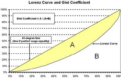
Deciles of Income Recipients from Lowest to Highest